What is a 'Digipak'?
A digipak is essentially an album case which is generally made of card. Digipaks are usually presented with a book styled format of having more than just a simple two sided case with one disc tray.
The general content of a digipak would be the CD case with the album/single name with the name of the artist on the front with the disc being inside along with and information or lyric booklet. On the back there is almost always a track list of what the album/single features.
Presentation of the digipak is essential as it is the front of the cover that catches the eye of the customer when the product is on the shelf. Therefore, the front cover must feature an appealing house style of fonts and colours which will be maintained throughout the digipak. Also, the images/logo/name of the artist will be presented as frequently as possible in order to make their image as recognisable as possible.
Conventions of a Digipak:
- Name of artist
- Name of album/single
- Pictures of artist
- Artist information - Vocalist, Guitarist etc.
- Track list
- Bar code
- Record label
- Copyright
- Consistent house style - font, colours etc.
- Spine - featuring artist + album/single name.
Digipak Research
Camo & KrookedNero
Swedish House Mafia
Chase & Status

Bad Album Covers
- Terrible quality of picture
- Doesn't reflect genre of the music
- No appealing house style / colour scheme
- Doesn't promote artist or album.
- No artist name
- No album name
- No obvious / appealing house style
- Doesn't promote artist or album
- No indication as to what genre it is
Record Label Research
Prav - Stockists
Band Logos & Image
Brand Image Decision
After researching into different
albums and adverts we decided we would take inspiration from the bands
we researched and go for a darker urban feel which matches the music
genre itself. We would keep a constant house style throughout the
DigiPack and the Album advert to give the band the overall band image
and would also make the overall product look professional and a high
quality piece.
Album Adverts
Conventions of Album Adverts
- Artist name
- Album name
- Image of artist
- Release date
- Use of brand image
- Artist logos
- Record company
- Websites - Artist + record company
- Key features of album
- Reviews + Rating
Individual Advert Analysis
Pendulum
Jordan - Chase & Status Advert Analysis
Own Digipak Ideas
Team Meeting
Team meeting - Discussion of digipak ideas
Sam
Jord
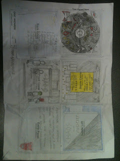
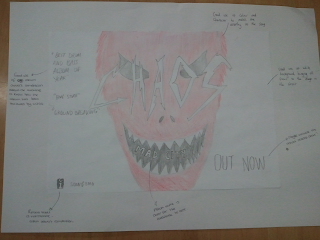
Here is a collection of our digipak ideas. We gave each of them to different groups in our class for them to look at and give us feedback. From the constructive feedback we received, we came to the conclusion that our final digipak would be a combination of mine and James'. James' idea of the urban setting reflects the drum & bass genre and feel of the song, whereas my use of the masks highlight our band image, therefore we agreed to combine the two to create an ideal drum & bass digipak.
Final Design
Digipak - First draft + Feedback
Prav
Jord
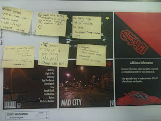
Here is a collection of the groups sketched ideas as to what our album advert will look like. We gave each of them to different groups in our class for them to look at and give us feedback. From the constructive feedback we received, we came to the conclusion that my idea was most ideal in terms of the urban, drum & bass theme and conventions that are expected from the advert such as the record label logo and caption saying 'number 1 drum & bass artist' etc.
Final Adverts + Feedback
Improvement planning sheet for advert and digipak:
Song List
- Mad City
- Fight It Out
- Hennessy
- Voodoo People
- Disc Wizards
- Rave
- Punch Drunk
- The Mad One
- Futura
- My Lucky Number


No comments:
Post a Comment